D Logos: Design Principles Behind the Letter D Logo and Beyond
What makes a single letter carry a brand’s entire identity? D logos prove that a letterform alone can communicate personality, industry, and visual sophistication — if the designer understands the geometry and visual weight behind the mark. A well-designed letter d logo balances the curve of the counter space against the vertical stroke, and that tension is where the character lives.
This guide covers the principles behind effective d logos, draws lessons from the arpanet logo’s approach to early tech branding, examines how the re logo uses secondary marks effectively, and explores how the salmon logo uses warm color psychology to differentiate brands in competitive markets.
What Makes D Logos Work
Geometry and Letterform
The letter D presents a specific design challenge: one vertical stroke paired with a large open curve. That curve — the counter — is the most visually active part of the letterform. D logos that succeed tend to do something deliberate with the counter: they tighten it into a semicircle for precision, flatten it into a soft rectangle for approachability, or open it into a wide arc for expansiveness. The relationship between the stem weight and the curve thickness determines whether the mark reads as modern, classic, technical, or organic.
Negative Space Techniques
Some of the strongest d logos embed secondary meaning in the negative space of the counter. The space inside the curve can hold a smaller icon, a wordmark initial, or a geometric shape that doubles the mark’s meaning. This technique rewards careful attention — the viewer discovers the hidden element after the initial recognition, creating a moment of engagement that sticks in memory. Negative space design requires precise weight management, because a stroke that’s even slightly too thick collapses the interior space.
Color and Weight Choices
Bold, single-color d logos in black or navy read as authoritative and established. Lighter weights in warmer tones feel more approachable and modern. When a letter d logo needs to work across a wide range of applications — from embroidery to app icons to billboard vinyl — stick to a weight that holds up at both small and large scale. Thin strokes that look elegant at full size disappear at 16 pixels.
Letter D Logo Case Studies
Corporate vs. Creative Brands
Corporate d logos tend toward geometric precision — equal stroke widths, tight spacing, neutral colors. Creative agencies and studios using a letter d logo often introduce irregularity: a slightly hand-drawn curve, an unexpected color, or a tilted axis that implies motion. The context tells you which direction to lean. A law firm and a design studio both might use the letter D, but the execution should communicate completely different personalities.
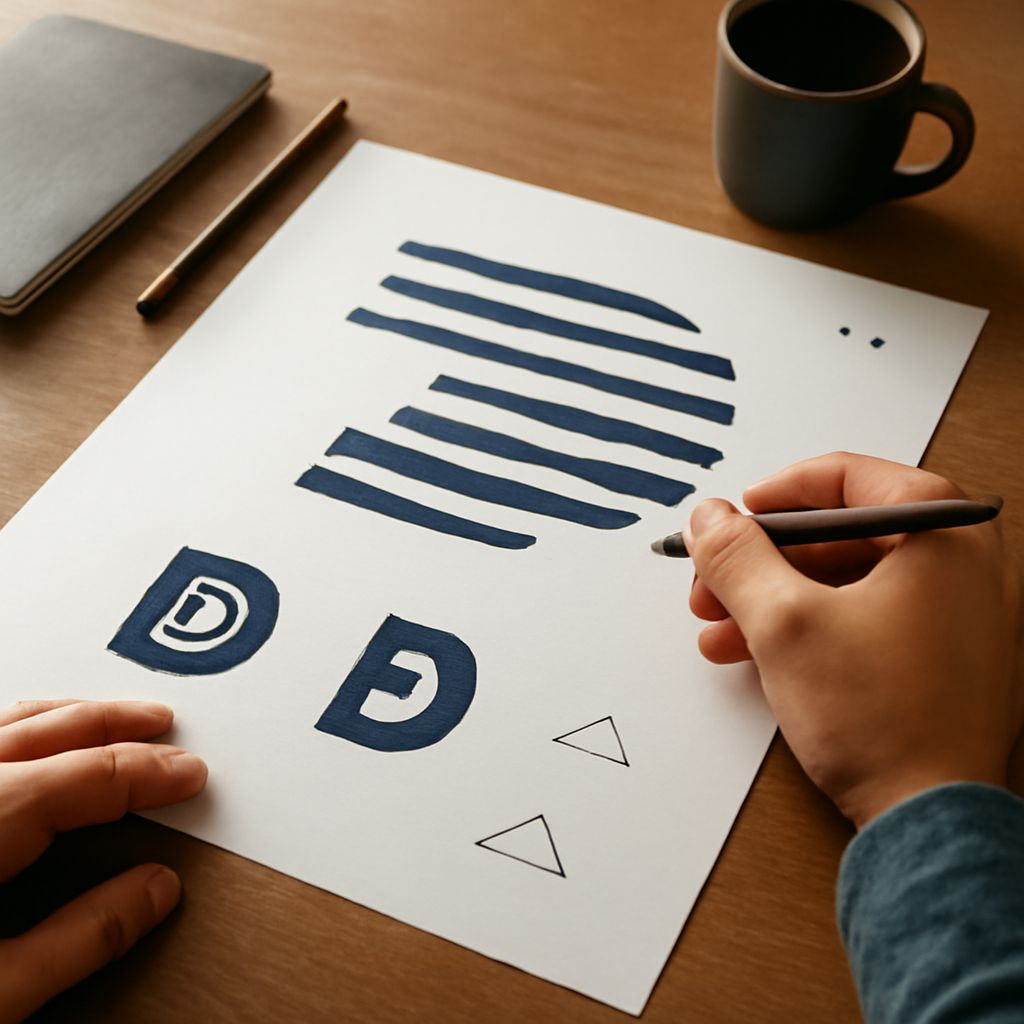
Monogram Applications
Many d logos appear as part of monograms — DM, DC, DB — where the D needs to coexist with a second letter without either dominating. In monogram design, the letterforms share space and sometimes share strokes. Successful monograms find a common visual language between the two letters, often by using the same typeface at the same weight with adjusted spacing.
Responsive Logo Sizing
A professional d logos system includes at least three versions: a full horizontal lockup with wordmark, a stacked version, and a standalone mark for small applications. The standalone icon version of any letter d logo should be recognizable at 32×32 pixels. Test every version against both light and dark backgrounds before finalizing the system.
Lessons from the Arpanet Logo and Historic Brand Marks
Simplicity in Early Tech Branding
The arpanet logo, used in the early days of the internet’s predecessor network, demonstrates how technical organizations approached visual identity before the design industry developed its current vocabulary. The mark prioritized legibility and functionality over aesthetic sophistication. Looking at the arpanet logo now shows you what visual communication looks like when technical clarity is the primary value — and it’s a useful counter-argument to overdesigned logos that prioritize cleverness over clarity.
How Old Logos Inform Modern Design
Historic marks like the arpanet logo reveal which design decisions age well and which don’t. Geometric forms hold up. Trendy illustrative styles don’t. Wordmarks in serif typefaces that were contemporary in 1970 now read as retro rather than authoritative. Study old logos to understand not just what worked then, but why it works or doesn’t work now.
The Evolution of Minimalism
Minimalism in logo design didn’t begin with modern rebranding trends. The reduction toward essential form has been a through-line in brand design for over a century. The difference today is intentionality — designers now choose minimalism deliberately, whereas earlier marks were often simple by practical necessity. Both can produce excellent results, but intentional minimalism requires more rigorous thinking about what to include and what to remove.
Re Logo and Salmon Logo: Color and Secondary Mark Strategies
Warm Color Psychology in Branding
A salmon logo uses color temperature as a differentiator. Warm pinks and coral tones occupy an underused space in the visual landscape of most industries — they stand out against seas of blue, black, and gray competitors. The salmon logo color family communicates warmth, approachability, and a certain modern confidence. It works particularly well for wellness brands, food and hospitality companies, and creative agencies that want to position themselves as friendly rather than corporate.
Pairing Letter Marks with Wordmarks
The re logo pattern — a two-letter combination in a tight lockup — shows how secondary marks build recognition without requiring a standalone icon. Two-letter combinations give designers more geometry to work with than single-letter marks, and the relationship between the letters creates visual rhythm. Kerning and spacing between the two characters is where most of the craft lives in a re logo design.
Logo Systems and Variations
Whether you’re working with d logos, re logos, or salmon logo color systems, the goal is the same: create a mark that works consistently across every application in the brand ecosystem. The mark needs to function on a business card, a website favicon, a building sign, and a social media profile simultaneously. That range of requirements is the real design test — not how the mark looks in isolation, but how it performs under constraint.