Blue Logos: What Color Psychology and Design Strategy Tell Us
Why do so many brands reach for blue? The answer lies in psychology, culture, and practical design considerations that have shaped brand identity decisions across every major industry. Blue logos carry associations of trust, reliability, calm, and authority that are remarkably consistent across cultures. From tech giants to banks to healthcare systems, blue has become the default color of credibility — which creates both opportunity and risk depending on how you use it.
But blue whale anatomy offers an interesting parallel: the blue whale’s size gives it unmistakable authority in any environment, and the best blue company logos work the same way — their scale of recognition lets them occupy visual space that smaller brands can’t. Understanding knife company logos that use blue as a contrast element, and software company logos that have made blue their technical signature, gives you a fuller picture of how the color actually functions across different brand contexts.
Why Blue Logos Dominate Brand Identity
Trust and Authority Associations
Blue logos trigger a consistent psychological response across demographics: calmness, reliability, and competence. This association appears to be cross-cultural, making blue a safer choice than colors like red or yellow when you need your brand to communicate stability across global markets. Financial institutions, healthcare providers, and government agencies lean heavily on blue precisely because they need trust before they can ask for any other response from their audience.
Industry Preference for Blue
Technology, finance, healthcare, and telecommunications all show a strong preference for blue logos. Look at the logos of the ten largest companies in each sector — blue consistently appears more than any other color. This concentration is self-reinforcing: blue became the default for tech because early tech companies chose it, and subsequent companies followed to signal they belonged to the same category. Blue company logos in these sectors work partly because they fit expectations.
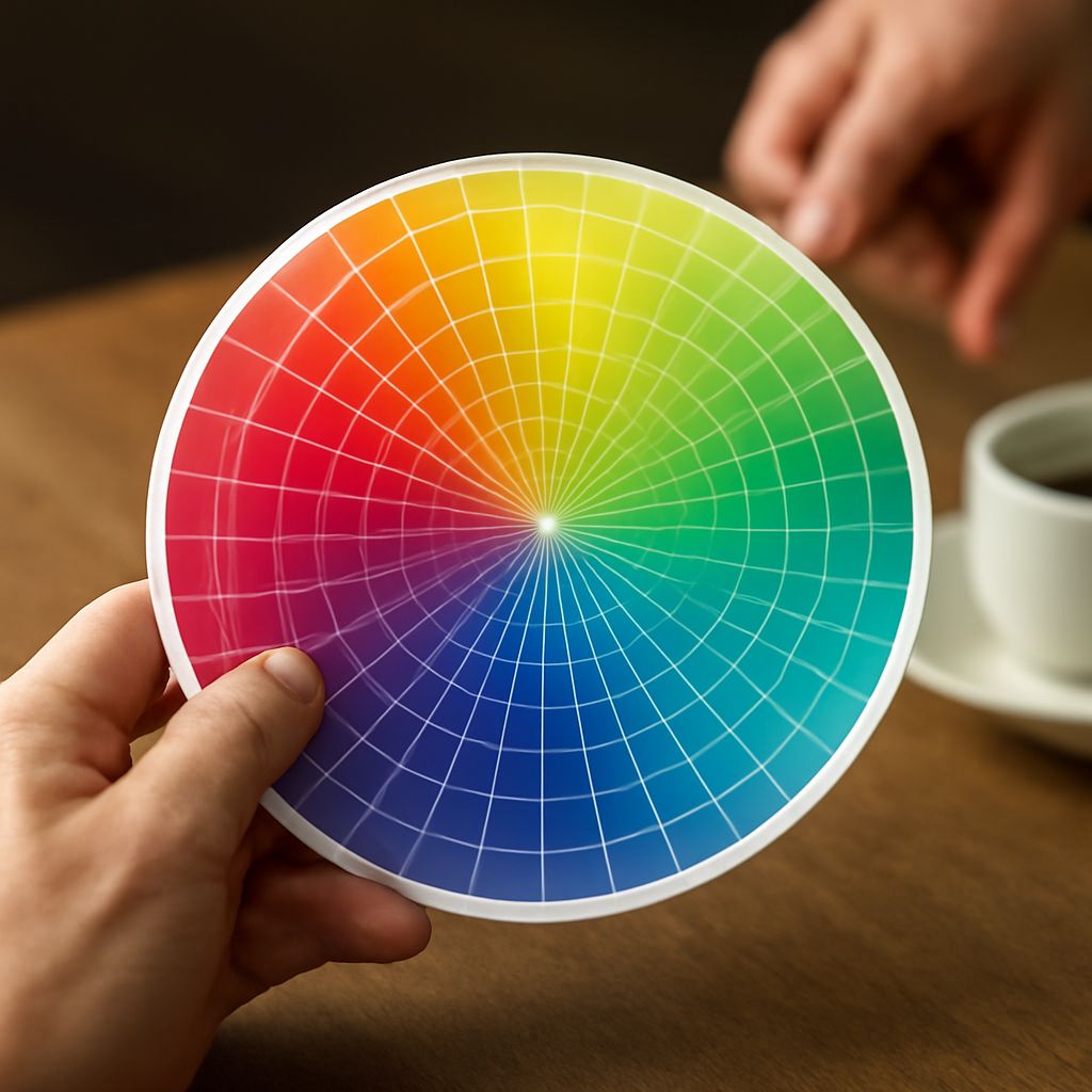
Shades of Blue and Their Meanings
Not all blues communicate the same thing. Navy and dark blue read as authoritative and traditional. Bright cobalt and electric blue feel energetic and modern. Pale sky blue communicates openness and approachability. Teal and turquoise bridges blue and green, suggesting both trustworthiness and creativity. When designing blue logos, the specific shade matters as much as the color family — a healthcare brand and a social media platform both use blue, but their shades should look nothing alike.
Blue Company Logos: Case Studies
Tech Giants and Social Media
The concentration of blue company logos in technology is striking. Major social media platforms, search engines, and enterprise software companies all anchor their visual identity in blue variants. The practical reason is partly that blue displays well on screens at high contrast. The psychological reason is that these companies need users to trust them with data, time, and money — and blue signals that safety before a single interaction occurs.
Financial and Healthcare Brands
Blue logos in finance and healthcare carry extra weight because the stakes in those industries are high. A blue color palette in a bank’s visual identity tells you the institution manages risk carefully. In healthcare, blue signals cleanliness, precision, and calm — associations that reduce anxiety in patient populations. Both industries use blue company logos extensively because the color’s psychological work reduces friction at the first point of contact.
Avoiding the Sea of Sameness
The risk of blue is that your brand disappears into a field of competitors using the same color. Differentiation comes from the specific shade, the mark’s form, the typography, and how you use blue in the full identity system. A distinctive geometric mark in a unique shade of blue stands out. A generic sans-serif wordmark in generic medium blue does not. The color alone is not enough — the design has to do work that the color cannot.
Knife Company Logos and the Role of Color Contrast
Sharp Aesthetics in Brand Design
Knife company logos face an interesting design problem: they need to communicate precision and performance without triggering anxiety. Blue appears in several successful knife brand identities because it pairs the precision association with the trust and calm associations that balance the inherent aggression of the product category. A cool blue paired with silver or white creates a clinical, precise aesthetic that positions the brand as a tool for serious craftspeople rather than a weapon.
Dark vs. Light Backgrounds
Knife company logos often appear on dark backgrounds — packaging, sheaths, handles. Blue logos on black read very differently than on white, typically appearing more electric and less authoritative. Test any blue logo design against both light and dark backgrounds before finalizing it, because the contrast environment changes how the color reads psychologically.
When Blue Works Against You
Blue logos fail when the brand needs to communicate urgency, excitement, or passion. Food brands using blue face an uphill battle because blue is a natural appetite suppressant — it rarely occurs in food, so the brain doesn’t associate it with hunger. Entertainment brands needing high energy often find blue too sedate. If your brand promise involves excitement, heat, or emotion, blue logos may actively undermine your positioning.
Software Company Logos and the Blue Playbook
Flat Design Trends in Tech
Software company logos have moved through several distinct aesthetic eras: ornate gradients and 3D effects in the 2000s, then radical flat simplification in the 2010s, and more recently a return to subtle dimensionality. Through all these shifts, blue remained the dominant color. The flat design era stripped away the visual complexity while keeping the blue, which revealed how much work the color itself was doing independent of any graphic treatment.
Icon vs. Wordmark Strategies
Software company logos divide roughly into icon-first and wordmark-first strategies. Icon-first marks, common among consumer-facing apps, use a distinctive symbol that works at app icon size and scales up. Wordmark-first marks, more common in enterprise software, use the company name set in a distinctive typeface. Blue logos work in both approaches, but the specific shade and saturation should match the scale at which the mark primarily appears.
Accessibility and Color Contrast
Any discussion of blue logos should include accessibility. WCAG contrast requirements specify minimum contrast ratios between text and background. Medium blue on white frequently fails contrast requirements for body text, while dark navy on white passes easily. If your software company’s logo appears against white in a UI context where the color also carries text, run it through a contrast checker before publishing. Good design that fails accessibility is incomplete design.