How to Write Calligraphy: A Step-by-Step Guide for Beginners
Have you ever looked at beautifully lettered wedding invitations or handwritten quotes and wondered if you could do the same? Learning how to write calligraphy is more accessible than most people think, and the fundamentals are learnable in a matter of weeks with the right approach and consistent practice. The learning curve is real — calligraphy rewards patience — but the basics of easy calligraphy are well within reach for any motivated beginner.
This guide walks you through the tools, letterforms, and practice routines that will get you writing with confidence. Whether your goal is simple calligraphy for personal projects or mastering how to start calligraphy seriously as a craft, the same foundation applies. By the end, you’ll understand exactly how to write calligraphy letters step by step in multiple styles.
Getting Started: Tools and Supplies
Choosing Your Nib and Pen
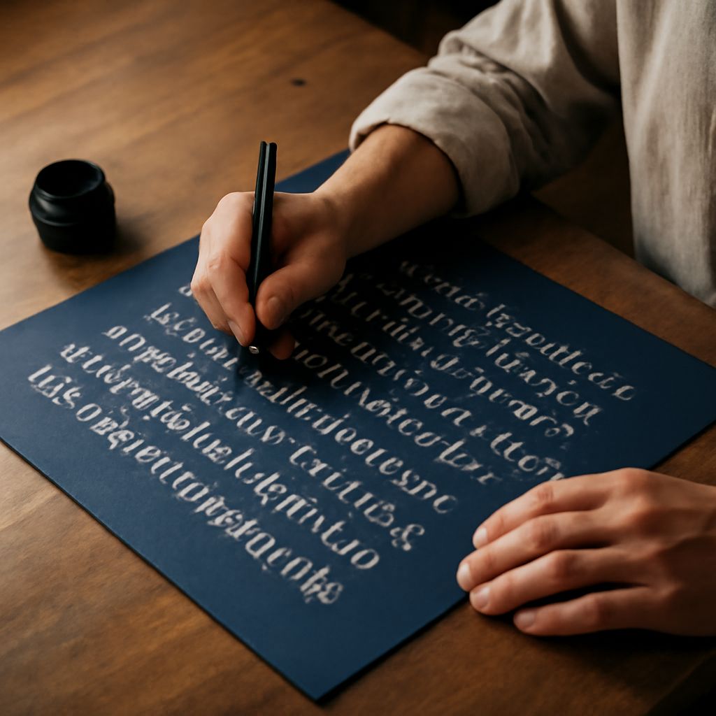
Your first decision when learning how to write calligraphy is which tool to start with. Dip pens with interchangeable nibs offer the most flexibility and produce the clearest pressure variation, but they require practice to load correctly without flooding or skipping. Brush pens are the most forgiving option for beginners — they respond to pressure naturally and are available in most art supply stores. Fountain pens with calligraphy nibs split the difference: they’re easier to maintain than dip pens but offer more control than brush pens.
Paper Types for Beginners
The right paper makes a significant difference in how calligraphy tools perform. Smooth, high-quality printer paper works adequately for initial practice. Rhodia and Clairefontaine notebooks are favorites among lettering artists because their paper is smooth enough for fine nibs without bleeding. Avoid heavily textured papers when starting out — the irregularity catches nibs and interrupts ink flow in ways that are frustrating before you’ve built foundational control.
Ink Selection Guide
Start with traditional black India ink for learning easy calligraphy letterforms. India ink is opaque, flows smoothly through most nibs, and shows up clearly on white paper, making it easy to evaluate your strokes. Once you’re comfortable with basic letterforms, explore iron gall inks for traditional scripts and modern calligraphy inks in a range of colors for decorative work. Avoid waterproof inks in dip pens — they dry in the nib and are difficult to clean.
Learning Easy Calligraphy Letterforms
Basic Strokes First
Before writing any letters, practice the five foundational strokes that most calligraphy alphabets share: the overturn (upward arch), the underturn (downward arch), the compound curve (S-shape), the oval, and the ascending loop. These strokes appear in almost every letter in Western calligraphy. Mastering them at consistent size and angle before touching full letters will accelerate your progress substantially. Fill an entire page with each stroke type before moving on.
Lowercase Alphabet Practice
Start with lowercase letters because they’re more forgiving than capitals and appear more frequently in written text. In easy calligraphy, the lowercase alphabet groups into families based on shared strokes: a, d, g, q share the oval construction; n, m, h, u share the arch structure; i, j, t, l share the vertical stroke. Practice each family together rather than going through the alphabet in sequence.
Uppercase Letter Techniques
Uppercase letters in calligraphy carry more visual weight and require more deliberate construction. Each capital is essentially a showcase stroke — it announces the sentence or word. For beginners learning how to write calligraphy, the uppercase letters are best approached after you have solid control of lowercase forms. The muscle memory and pressure control you develop in lowercase work transfers directly to the larger, more complex capital letters.
Simple Calligraphy Styles to Try First
Italic Script Overview
Italic script is the most practical starting point for simple calligraphy. It uses a broad-edged pen held at a consistent angle, and the letterforms are based on the oval rather than the circle, which gives the writing a forward-leaning energy. Italic is highly legible, works for both formal and informal applications, and teaches the pen-angle discipline that transfers to more complex scripts. Most calligraphy teachers recommend italic as the first script to learn.
Brush Pen Lettering
Brush pen lettering gives you the look of traditional brush calligraphy with significantly lower barrier to entry. You don’t need to mix ink or load a nib — the ink is self-contained and the flexible tip responds to pressure the way a traditional brush does. The key technique is using the full belly of the brush tip on downstrokes (for thick lines) and the tip alone on upstrokes (for thin lines). This pressure differential creates the characteristic thick-thin contrast of calligraphy.
Gothic and Copperplate Basics
Gothic blackletter and Copperplate are more demanding styles that reward patience. Gothic uses a broad-edged pen at a steep angle and produces the dense, textured letterforms associated with medieval manuscripts and formal certificates. Copperplate uses a flexible pointed nib and extreme pressure variation to produce hairline upstrokes and broad downstrokes. Both are worth exploring once you have solid command of italic, but both will frustrate beginners who attempt them without foundational pen control.
How to Write Calligraphy Letters Step by Step
Pressure and Release Technique
The fundamental skill in learning how to write calligraphy letters step by step is pressure management. On downstrokes, apply pressure to spread the nib or engage the brush, producing a thick line. On upstrokes, release pressure to produce a thin line. The transition between thick and thin happens at the curve of each letterform. Practice this pressure-and-release rhythm on basic strokes before applying it to full letters.
Connecting Letters Smoothly
Once individual letters are consistent, the next challenge in how to write calligraphy is connecting them into words. The exit stroke of each letter should flow naturally into the entry stroke of the next. Practice writing common two-letter combinations before full words — “ou,” “an,” “in,” “th” — because the connections between these pairs appear constantly in English text. Rhythm matters as much as precision; calligraphy that flows looks better than calligraphy that’s technically accurate but stilted.
Common Beginner Mistakes
The most common mistakes when learning how to start calligraphy are inconsistent pen angle, too much pressure on upstrokes, and rushing through letterforms before the muscle memory is built. Slow down deliberately — calligraphy written too fast loses the control that makes it beautiful. Use guidelines to maintain consistent letter height and baseline. Date your practice pages; reviewing your progression over weeks shows improvement that’s invisible day-to-day.
Building a Consistent Practice Routine
Daily Drills That Work
Twenty to thirty minutes of focused daily practice beats two-hour weekend sessions for building calligraphy skill. Spend the first ten minutes on foundational strokes, the next ten on current letterform practice, and the last ten on a short word or phrase that incorporates your recent focus. This structure ensures you’re always reinforcing fundamentals while also making forward progress.
Tracking Your Progress
Keep a dedicated practice sketchbook and date every session. Photograph your practice pages weekly. Looking back at where you started six weeks ago is one of the most motivating things you can do when the day-to-day progress feels slow. The improvement in simple calligraphy is real and measurable — you just need enough time horizon to see it clearly.
Moving from Simple to Complex Styles
Once you can write a full alphabet in italic with consistent letterforms and smooth connections, you’re ready to explore more demanding styles. The skills transfer: pen control, pressure discipline, rhythm, and spatial awareness all apply whether you’re writing italic, Copperplate, or Gothic. Master one style fully before adding another — depth in a single script is more valuable than surface-level familiarity with many.
Pro tips recap: Start with a brush pen and smooth paper, drill foundational strokes before letters, and practice in short focused sessions daily rather than long infrequent ones. Consistent repetition over weeks, not hours, is what turns how to write calligraphy letters step by step into muscle memory you can rely on.